
Brochures
Stories that unfold in your hands


Favor the bold
CLient: William Penn foundation
2017
This three-piece set of folding brochures uses vividly-colored panels and strong imagery to convey the core messages behind the William Penn Foundation's three main areas of grantmaking.
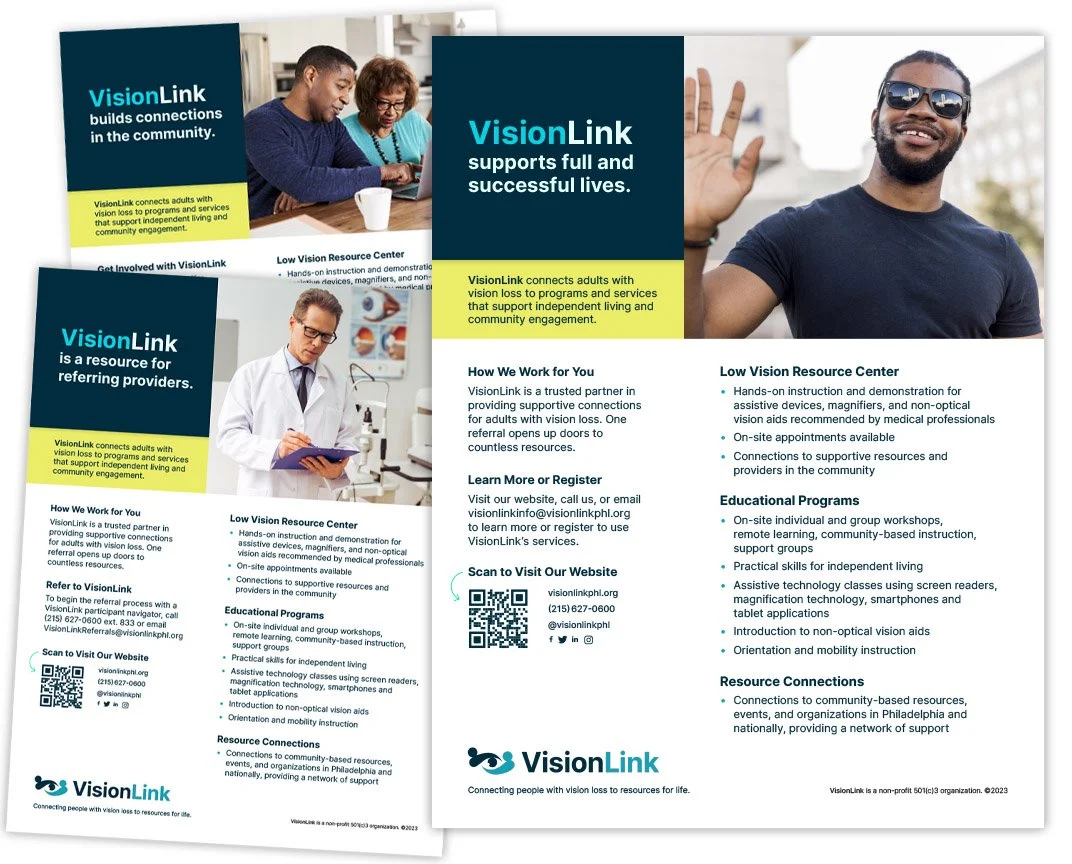
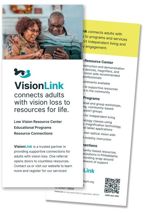
A series of flyers created for individuals, for community organizations, and for healthcare providers emphasize ease of use for low-vision readers.
Rack cards designed to stand out at doctor’s offices.

Small “palm cards” use QR codes to link to key website pages.
What you don’t see is what you get
Client: Visionlink
2023
VisionLink provides resources and connections for Philadelphia’s low-vision community. SAYGRID performed a full brand identity refresh for VisionLink, who , after a brand audit, discovered that their logo, typography, website, and collateral were not meeting benchmarks for accessible design. SAYGRID performed a full brand identity refresh, including a refreshed website, using the principles of accessible design to form its “brand DNA,” including variable fonts, high-contrast colors, representative photography, and clear typography. A rush of accessible collateral followed, including flyers, rack cards, palm cards, business cards, large format signage for events, and more.
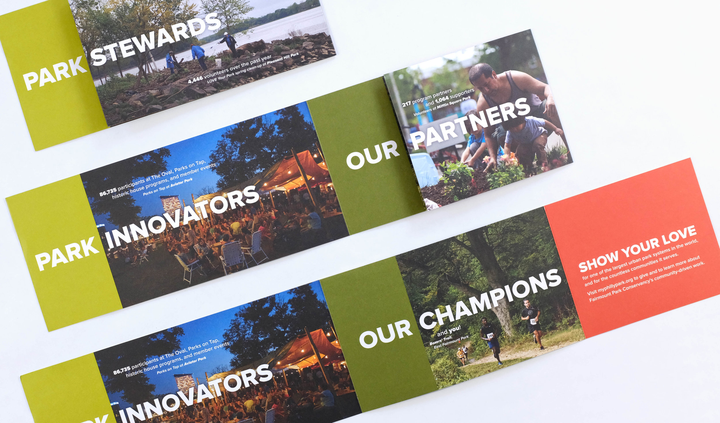
Interactive calls to action
Client: Fairmount Park conservancy
2016 & 2017
Fairmount Park Conservancy mails special collateral to their members annually to share highlights of the year's programming, and to raise funds. The bold, rhythmic messaging for their 2016 campaign, shown above, connects more deeply with the audience by unfolding into a panoramic card. The collateral for each year are designed to fit within standard envelopes.
High impact, low weight
This collateral posed a particular design challenge: create an entire mailer kit that weighs less than three ounces, to meet postage requirements. The final kit included a ten-panel brochure, with a perforated panel for a tear-off reply card, as well as matching stationery and envelopes.

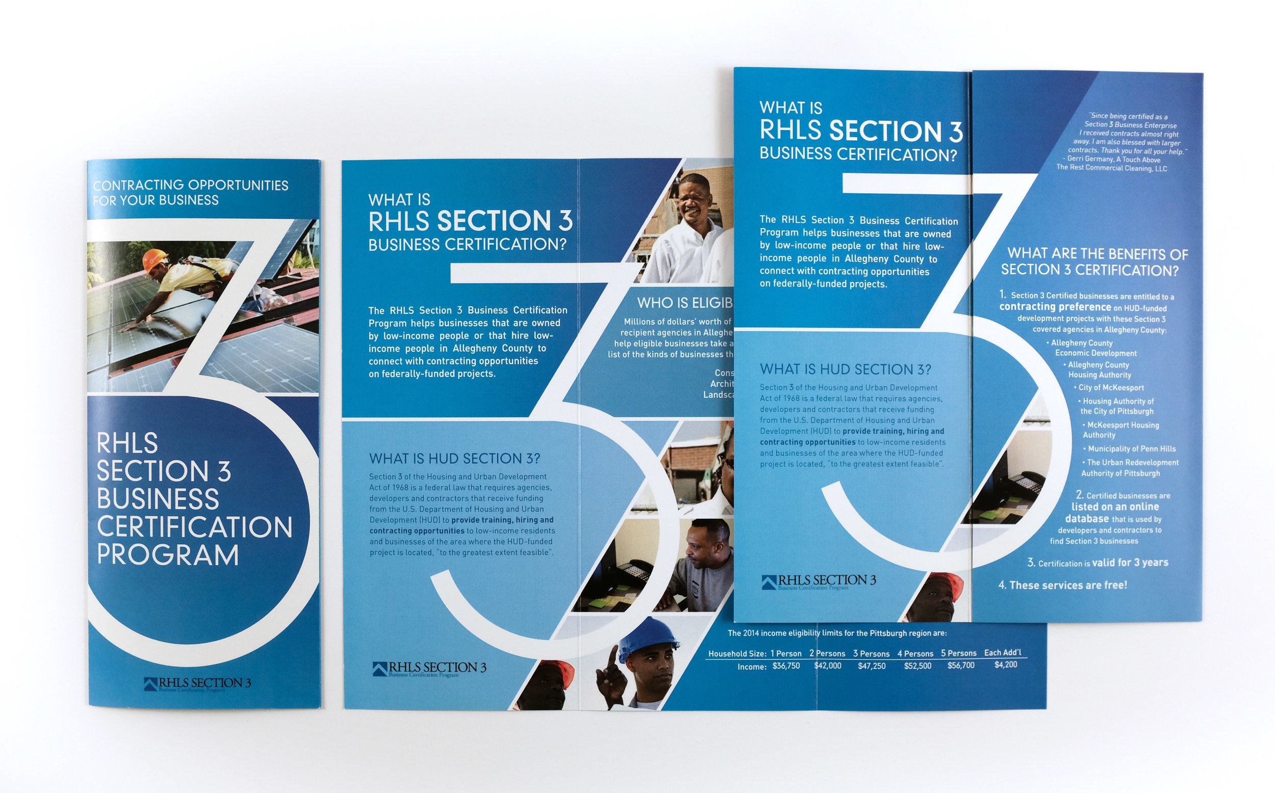
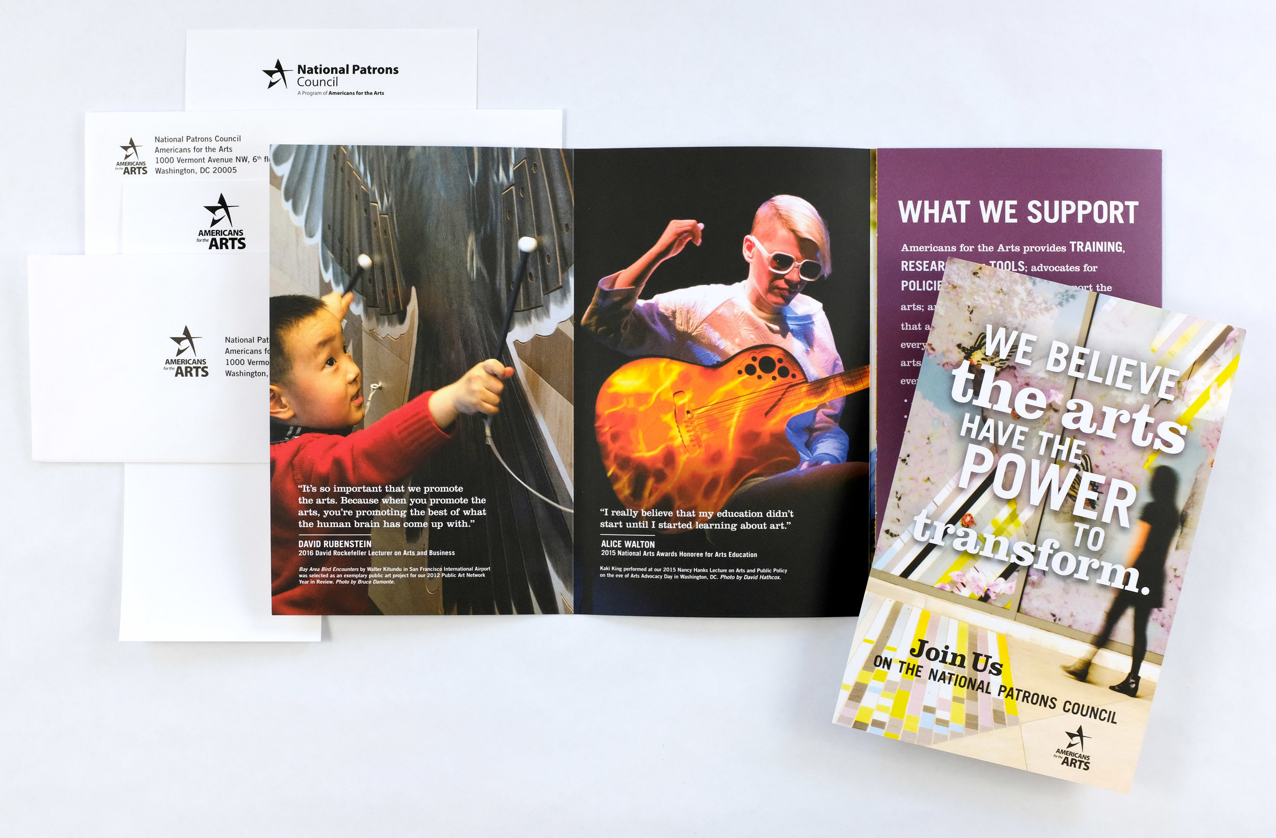
Elevating the trifold
Even a humble trifold brochure should make a lasting impression, as with these versions for Americans for the Arts and Regional Housing Legal Services. Panels can create layers of narrative, which present opportunities for design elements to align across folds and edges.

Maximal impact, minimal waste
client: Americans for the arts
2011
This brochure for Americans for the Arts is square and features a skinny panel for specific language, but there's some behind-the-scenes thinking, too: the brochures can be printed using standard stock paper sizes, resulting in minimal paper waste. I leverage my print production experience to optimize value, during the design process and the printing process.
